Tuesday, September 13, 2011
Updated Customer Guide

Thursday, June 30, 2011
Embedding Fonts in a PDF Workflow
Fonts!
Why are fonts still and issue in a PDF workflow?
During early days of PostScript printing, we only had to deal with Type1 and True Type fonts. Now we have multiple master fonts, fonts for home use, fonts for web use and fonts for printing among others.
When creating a document in a page layout program (Indesign or Quark, not Microsoft Word or Publisher), the operator must be aware of the fonts installed on their computer. If the document is to be opened on a different computer the “identical” fonts must also be installed on the other computer. Even though Macs and PCs have gotten closer together we still experience cross platform issues with fonts. Then there is the issue of embedding the font when creating the PDF and what’s up with some font embedding and some fonts not embedding?
Well not all fonts are created equal. Not to mention names but, SF fonts are intended for web only and/or home use and will not embed when the operator creates the PDF. Fonts acquired as a throw in with some applications are not intended for print use. Ornamental fonts on Christmas or Birthday cards are cute and cool, again they were not created for high-resolution printing. Other reasons for fonts not embedding include having the screen font installed without the bitmapped or printer font. Corrupted fonts may also not embed.
So how does a prepress operator guard against providing their print provider with a PDF that has all of the fonts embedded. In the case of GDI we provide PDF Job Setting files on our website http://www.graphicdevelopments.com/home/downloads.html. Using our job setting file will insure that all embeddable fonts will be embedded.
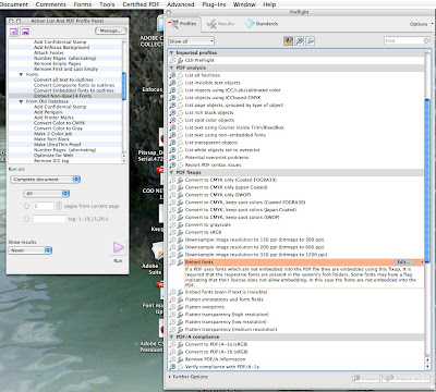
Now that we think we have created a good PDF how can we check it to make sure all the fonts are embedded? If you are lucky enough to have Enfocus Pitstop, you can check and embed or replace any font that Pitstop deems not embedded. For those of us that live in a more frugal world, Acrobat Pro has a built in feature in it’s preflight utility that allows the user to embed fonts. To access the Preflight Utility go to Advanced-Preflight. However, you will have to look at the preflight report if you want to make sure all the fonts did get embedded. See the screen shot below:
Last but not least, GDI does have Pitstop and a great workflow that allows us to embed fonts at the preflight stage or at the ripping stage of document processing. That requires a little extra effort on our part, but if our customer can’t make the file work we can. And we provide this service free of charge and in most cases transparent to our customers.
Friday, June 17, 2011
One of the worst mistakes a designer can make!
As a printer we have several options.
1: Return the file to the designer
2: Convert the file using Pitstop
3: Convert the file using Acrobat
4: Convert the file when we rip the file
5: Export all the RGB data to Adobe Photoshop and covert it to CMYK
Unfortunately options 2-5 may have undesirable results. Each of these option may not produce the RGB color accuracy that the designer or the designers customer/editor/publisher may have intended. Every prepress program uses a different color conversion engine and or profile converter, including Adobe Photoshop. In addition, the RGB color space has a larger color gamut than does our press cmyk gamut. Red and Greens get clipped in cmyk. Black type and black fills will convert to CMYK black (high percentages of cyan, magenta, yellow and black). Any misregistration on press will appear ans blurry type or filled in reverse type. Option 5 is time consuming and can be considered a chargeable AA.
So as a printer we ask our friends to verify that all text and images be checked in Adobe Acrobat prior to uploading the files to us. In addition, if pages are black and white it would be a good idea to convert them to black and white prior to sending them to us as well. We all want to achieve expected results and these tips may help you get their.
To check you color in Adobe Acrobat without pitstop. Open the file in Acrobat. Go to the "Advanced" pull down menu, "Print Production", "Output Preview". Select the "show" rgb. If your file has rgb data it will display in the file. Change to "show" cmyk and Acrobat will show just the cmyk data. View the sample images below. If you have determined that the file has RGB data go back to your layout program and fix the RGB.


Thursday, February 26, 2009
New Standards for postal indicia location.
EFFECTIVE DATE: March 29, 2009 Reference: DMM 302
The Postal Service adopts new address placement and formatting requirements for Periodicals, Standard Mail®, Bound Printed Matter, Media Mail®, and Library Mail flat-size pieces sent at automation, presorted, or carrier route prices. We also adopt related revisions for automation and presorted First-Class Mail® flats.
The new standards require:
• The entire delivery address in the upper portion of all Periodicals, Standard Mail, Bound Printed Matter, Media Mail, and Library Mail flat-size pieces mailed at automation, presorted, or carrier route prices.
• The new standards define “upper portion” as the top half of a mailpiece; however, we encourage mailers to place the address as close to the top edge as possible (while still maintaining a 1/8-inch clearance from the edges).
• For enveloped or polywrapped flat mail, the upper or top half is either of the shorter edges of the mailpiece. For bound or folded flat mail, the bound or final folded edge must be vertical and on the right side, with an exception for Carrier Route (or Enhanced Carrier Route) saturation mail, where either of the shorter edges can be the top. If the delivery address is on an insert in a polywrapped flat, address must remain in the upper half throughout processing and delivery.
• Mailers may place the address parallel or perpendicular to the top edge within the upper portion of the mailpiece, but not upside down as read in relation to the top edge.
• If a vertical address does not fit in the upper half, address may pass midpoint if placed within 1” of the top edge.
• Mailers must also address ALL presorted, automation (this includes First-Class Mail in addition to the classes of mail mentioned above), and carrier route flatsize mailpieces using a minimum of 8-point type (.080” high), with our preference being all caps and using a sans serif font, or;
• If the mailpiece bears a POSTNET™ or Intelligent Mail® barcode with a delivery point routing code for automation pricing, the address may be a minimum of 6-point type (.065” high) in all capital letters.
• In addition, for ALL automation price pieces, the characters in the address must not overlap, the address lines must not touch or overlap, and each address element may be separated by no more than five blank character spaces.
• Postage and Delivery Address must be on the same side of the mailpiece. Postage must be in the top, right corner of the mailpiece or address area. Postage must have the same “read direction” as the Delivery Address. This does not apply to Periodicals that are not required to display postage.
See illustration below.

Monday, December 15, 2008
Converting CMYK Black Type to 100% Black

- Open the file in Acrobat.
- Utilizing the Touch Up Tool Circled in red.
- Right or control click on the picture that you want to fix.
- Select the "Edit Image function". The image will open in Photoshop.

 Using the marque tool draw a marque around the black type that you want to change.
- Notice that type that is eyedropped is made up of all 4 colors.

- Now utilizing the adjustments--channel mixer menu. Select Monachrome and move your black slider to 100%.
- Now the type that was inside the marque becomes black in the center and some shade of black on the edges.
- Save the file and it will be placed right back into the pdf in the same location t
 hat it was originally


Friday, December 12, 2008
GDI CUSTOMER GUIDE TO GOOD WEB OFFSET NEWSPAPER PRINTING
• All files transmitted to GDI should be in Adobe Portable Document Format (PDF)
• Files should be sent to the size of the media box.
• Files should be sent in the form of PDF 1.3, and must be PDF/X-1a compliant.
Acrobat distiller job setting can be downloaded from our web site
www.graphicdevelopments.com.
Black & White Type
Sans serif type faces are the best choice for newsprint reproduction. Type faces with thin or delicate serifs and strokes, and non-uniform character thickness, should be avoided.
Extremely thin strokes can drop out in the conversion process, while thick strokes can
fill-in on the press. For clarity and readability, we recommend using type sized at least 7 points for black type without a screen.
Screened Type
When using screening type, avoid fine to medium weight type and use sans serif
typefaces. Type should be sized at least 10 points bold.
Reversed Type
To assure quality reproduction use type sized greater than 10 points.
Surprinted Type
When surprinting type over a tint, avoid use of a screen (background) heavier than 30%.
Dot Gain and Blowout
When screening halftones and screens (shades of black), allow for dot gain on the press
(i.e. the dot enlarges on absorbent paper). In the high-light and shadow area, a 5-8% gain occurs and in the midtones a gain of 18-22% occurs. A highlighted dot less than 2% will appear white (blowout) and a shadow dot greater than 95% will appear solid black on
press.
100 Line Screen
Dot area for Black
Image Gain Printed
75% 15% 87%
50% 18% 68%
25% 14% 39%
Any value over 95% will print 100%
Color
Color Ads are designated as either Multi-color (CMYK) or Spot color (also CMYK.).
Spot colors sold and printed in the newspaper industry do not match Pantone color.
Pantone Tru Match System Colors (PMS Colors) are not recognized spot colors in the
newspaper industry. A PMS color is always translated to the CMYK equivalent. That
CMYK equivalent, when printed on newsprint, will not match the PMS color as it
appears in the Pantone swatchbook. Many of the colors found in the Pantone swatchbook
are out of the gamut (printable range of colors) of newspaper production.
Multicolor Ads
A maximum total area coverage of 230% to 240% is recommended with only one solid.
Any secondary colors should not exceed 80% each.
100 line screen ROP 4 / Color Tone Reproduction Guidelines:
Highlight: Cyan-4% Magenta-2% Yellow-2% Black-0%
Shadow: Cyan-60% Magenta-50% Yellow-50% Black-80%
Gamut: The range of tones or colors that can be produced by a system or device.
Michael Kieran, "The Color Scanning Success Handbook" (1997) *estimated
The human eye is capable of detecting a very wide range of color. In fact, its color range or gamut is far greater than that of a color scanner, printer or printing press. This difference makes color scanning and printing very challenging.
Images
Scanning Resolution: 254 pixels per inch at 100% of final output size.
Gray Component Replacement (GCR)
GDI recommends Gray Component Replacement (GCR). "The theory behind GCR is that
whenever cyan, magenta, and yellow are present in a color, that color must have a gray
component. With GCR, some or all of this gray component is printed with black ink,
thereby reducing the amounts of colored inks required." Reduction of ink limits rub-off
and color saturation. "GCR also helps solve a major problem in color printing: producing consistently neutral grays. In traditional process color reproductions, neutral grays are created by delicately balancing the three process inks. A slight variation in the amount of any of them can result in visible color shifts. Printing with GCR separations removes this problem, allowing neutral grays to stay neutral because they are made primarily with black ink. Another advantage of GCR is that it reduces the effects of variations on press,so when ink coverage varies, the colors become slightly lighter or darker rather than changing hue. "If you’re creating color separations in Adobe Photoshop, set the black generation in the Separations Setup dialog box to Medium; the None setting for GCR has no practical value, and the Maximum setting can be dangerous because any neutral color will appear grainier than the rest of the picture." For further information see The Color Scanning Success Handbook by Michael Kieran.
Spot Color
Spot Color Ads (are not really spot)
Spot colors in the newspaper industry are pre-defined CMYK colors to be used in
addition to black. Spot color ads are positioned and treated differently from multi-color ads. The Spot colors listed below are the only predefined spots colors available.
Spot Color Image
All spot color ads should be prepared as CMYK composite files.
DO NOT prepare separations for spot color ads in newsprint.
Color images must be CMYK, including duotone images.
When creating an ad to be printed as spot color, there must not be any information on the unused plate (or channel in Photoshop.) Example: A spot color ad using #75 RED (m100 y60) should not have any information on the cyan plate. Any supporting files such as a Photoshop image or an Illustrator EPS must follow the same rule. All color elements in a spot color ad must be prepared with the specified CMYK mix or a tint of that CMYK mix.
Pantone Colors
Pantone Tru Match System Colors (PMS Colors) are not recognized spot colors in the
newspaper industry. A PMS color is always translated to the CMYK equivalent. That
CMYK equivalent when printed on newsprint will not match the PMS color as it appears
in the Pantone swatchbook. Many of the colors found in the Pantone swatchbook are out
of the gamut (printable range of colors) of newspaper production.
Other Things to Avoid
Rich black Black =100 Cyan =30 Magenta =30 Yellow = 30
Any Ad entry that’s in RGB (red green blue) or Lab color space.
Knock out text set to overprint. Depending on your Acrobat preferences knock out text
set to overprint may display properly, but will print overprinting the background, Ink is not opaque so when one color over prints another the two colors combine (i.e. yellow
type on blue background will come out purple)or in the case or white text, the type will disappear.